Background
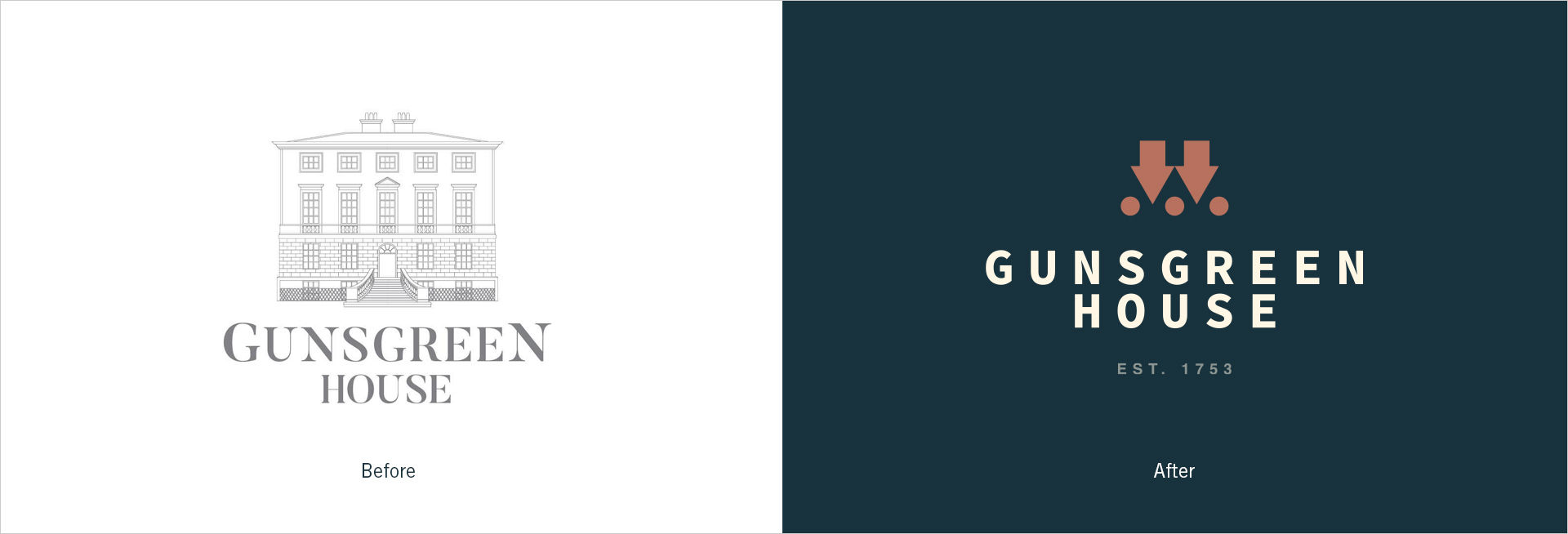
Throughout the years, our client had been through several rebranding processes, which resulted in a mash-up of styles from previous identities. Existing branded touchpoints carried a range of logos and themes with little cohesion; none of which differentiated Gunsgreen from its competitors.

Approach
It was this intriguing "dark underbelly" of its past that offered the cornerstone upon which to build the identity around.
From the "experience" element of visiting the old underground cellars and hosting wedding days, the goal was to ensure that Gunsgreen House was positioned as the venue and visitors’ attraction with a difference.
We began work to create concepts that would capture the essence of its past which could then thread through the three key themes of explore, space, and shop.


Delivery
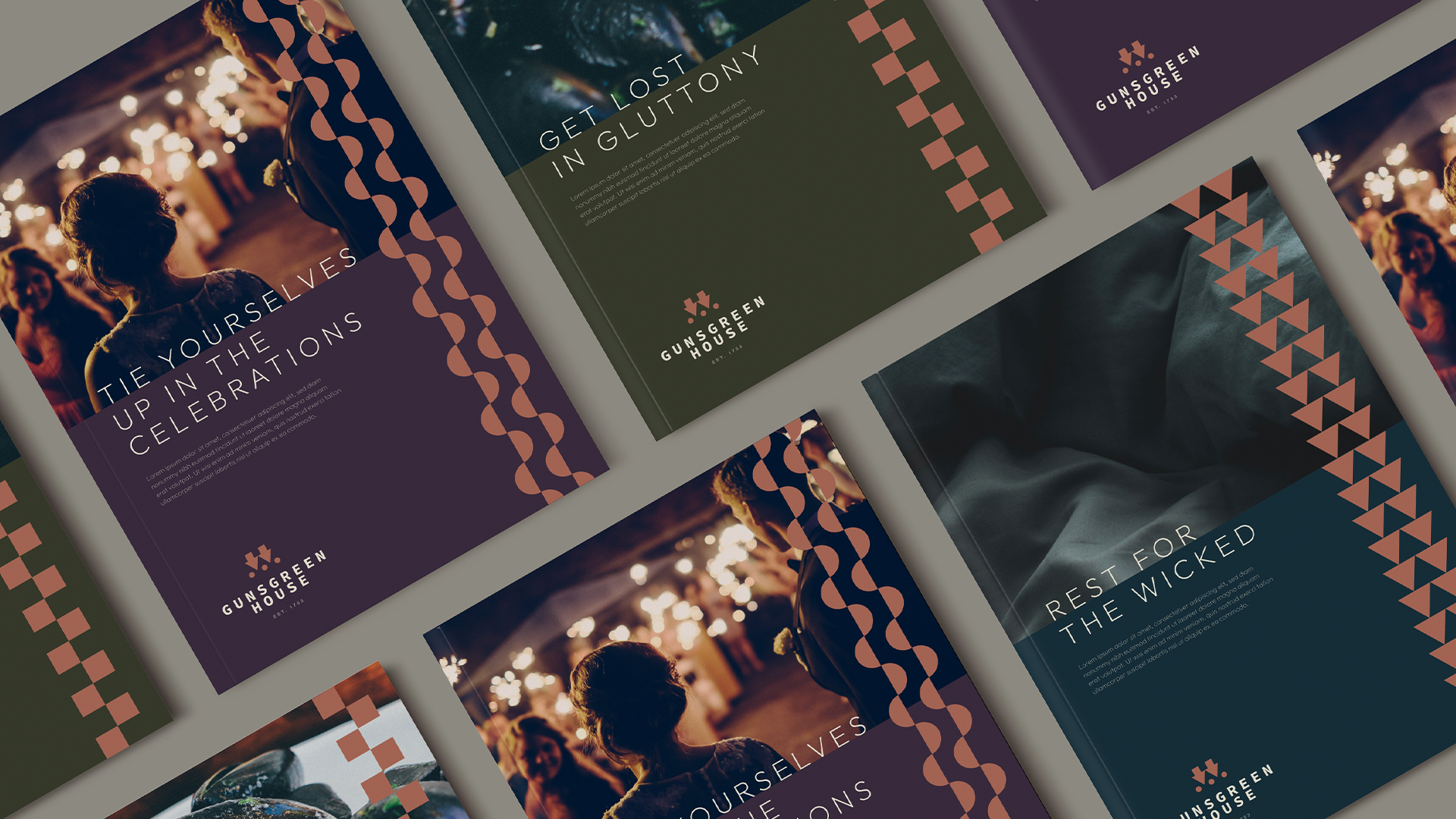
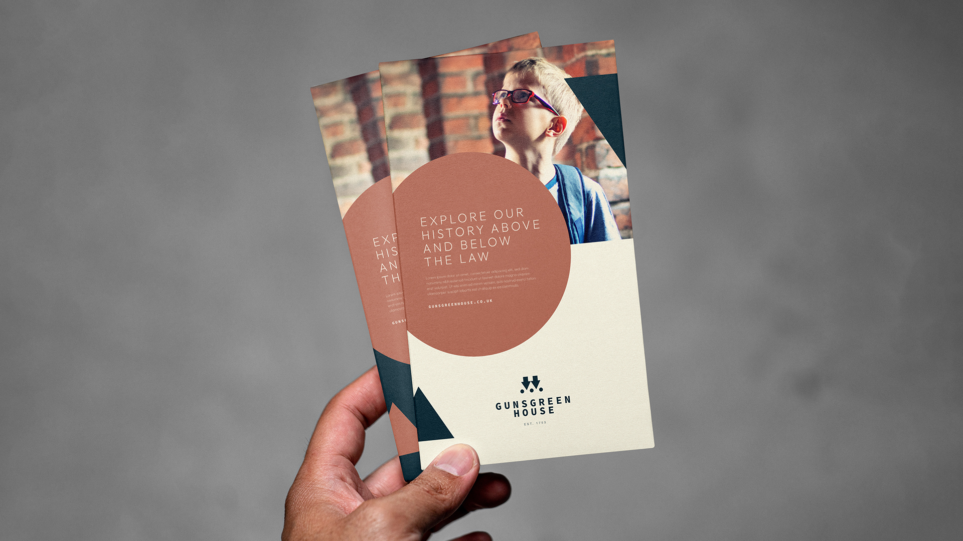
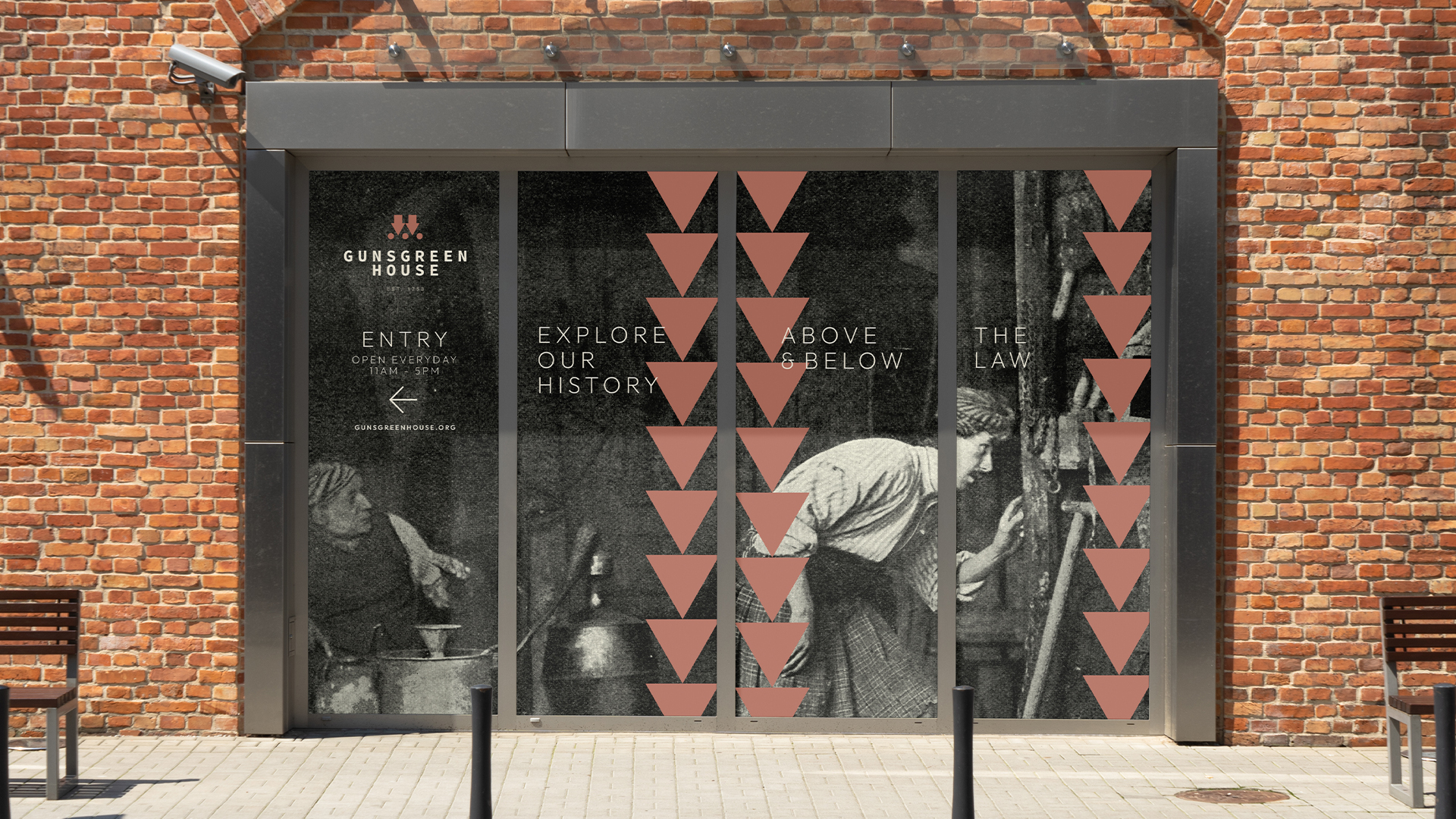
The result is a distinctive, coherent identity formed around the idea of contrasts inspired by the "above and below" of the house with the intention of striking the balance of leaning on its heritage whilst presenting itself as a contemporary place, at which to visit, rest and celebrate.
The theme of contrasts also fed into the tone of voice which was developed to further strengthen the feeling of "light and shade".
The logo and colour palette draws inspiration from the external features of the house. Creating harmony with the landmark and location itself whilst ensuring that the branded touchpoints in and around the landmark feel like a true extension and representation of the property.

Learn more about Gunsgreen House or plan your visit through their website.

