Background
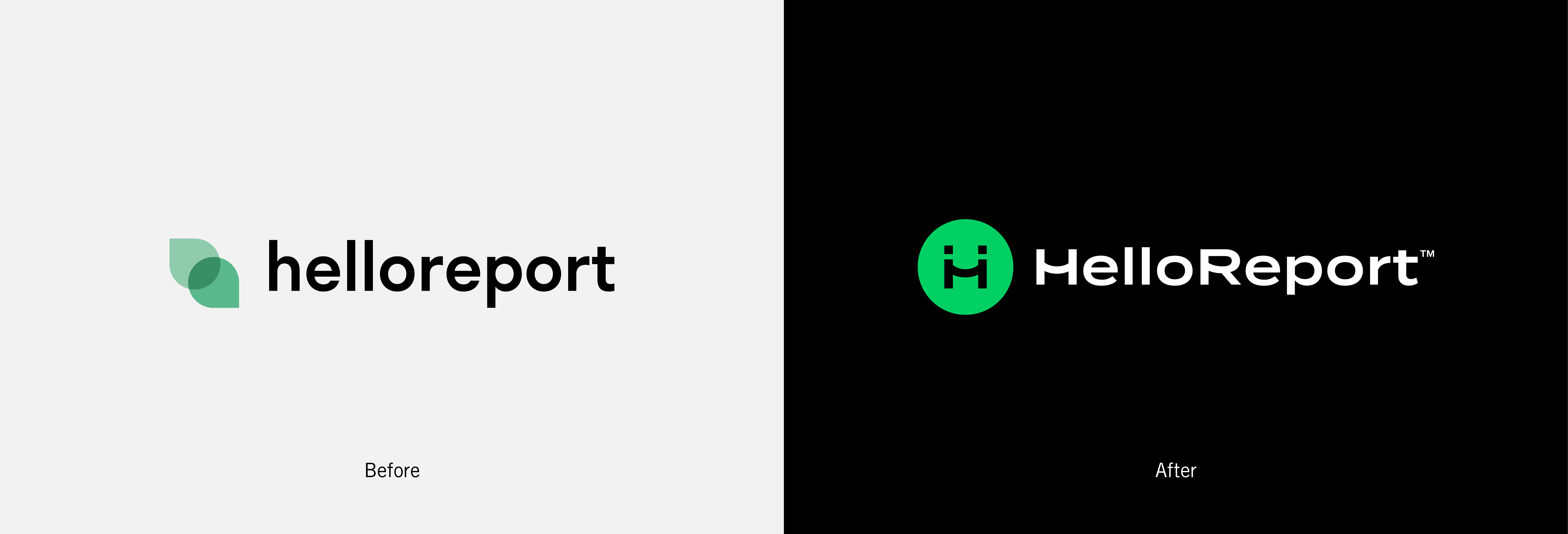
The product had established a good foundation of subscribers in its existing guise, but the team felt that the time was right to push on again and explore the idea of a full rebrand.
There were various developments in the pipeline with regards to product development providing a good opportunity to look at the brand's identity holistically which could then be applied and launched seamlessly across all touchpoints including the software itself.
Approach
We started the project by speaking to the team at HelloReport to get a true understanding of their vision for the brand. This also gave us the opportunity to get a real understanding of their personality and approach to customer support and service.
As a young, dynamic and professional team they wanted to create an identity for the brand that would really reflect themselves as well as the qualities of the product as a whole; A brand that they were proud of which would help cement their position in the industry as a reputable, contemporary and dynamic SaaS organisation.
Delivery
The chosen route was created to strike a balance between sophistication and approachability, focusing on highlighting the benefits and features of the software with a "tech" orientated look and feel.
The strong use of green formed the basis of the branding which was inspired by the traffic light colour indicators featured within the software itself, with green being the "positive" colour within the UI.
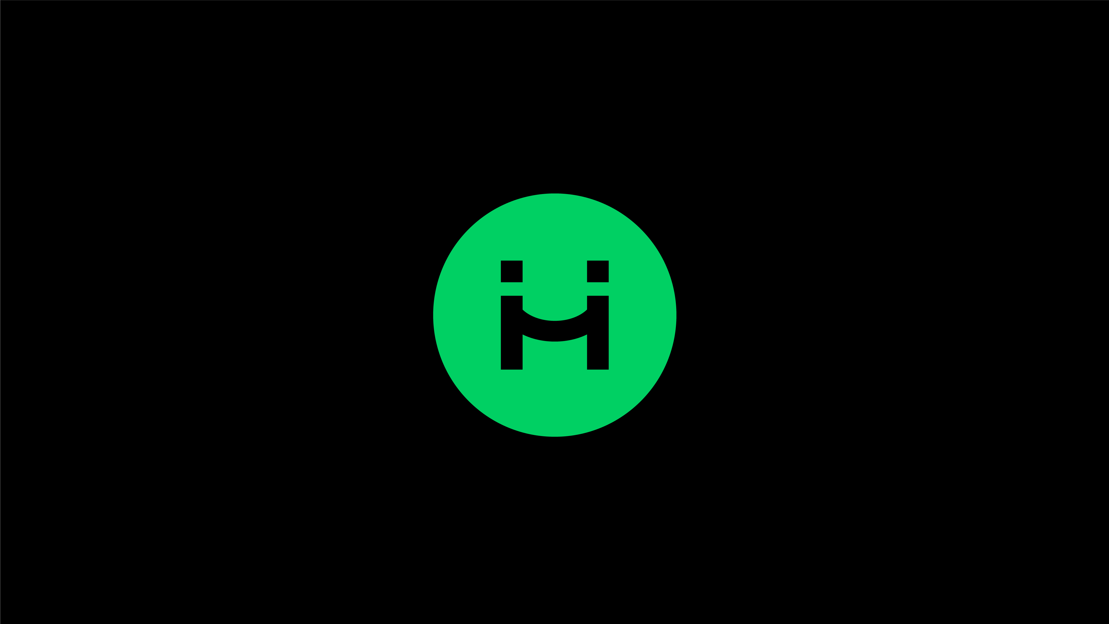
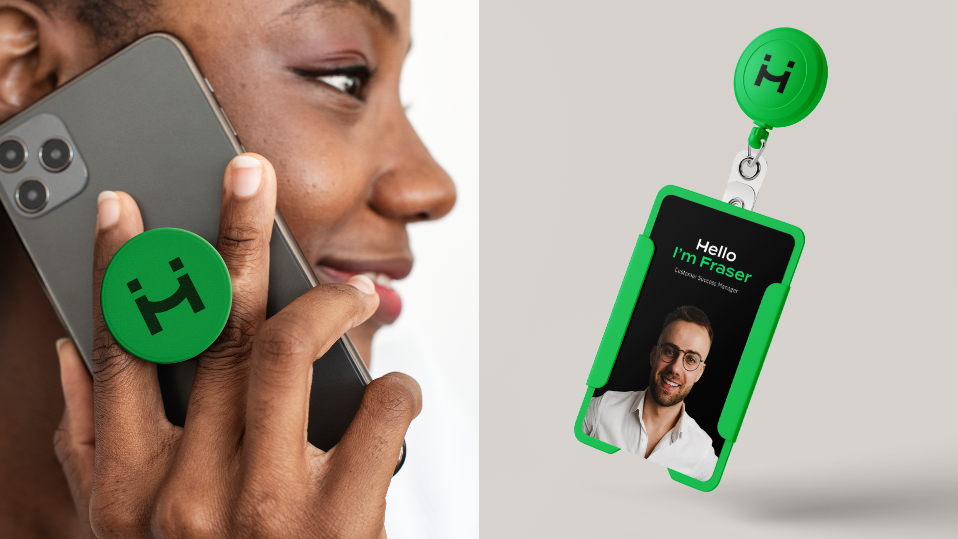
The logomark features the green from the primary palette and includes a simple yet distinctive line-work motif which shows two "i" characters, one representing the information coming from the landlord or estate agent and the other representing the tenant. These two characters/information come together to "shake hands" in agreement creating an abstract shape of an "H" with a reworked crossbar to create the form of a smiling face.
These "smiling" details were also worked into the logotype to build on strengthening the positive feeling through the identity.
The use of black within the palette provided a strong and sophisticated foundation that helped to accentuate the primary traffic light colourway which reflected the key tags of; excellent, fair and unacceptable.
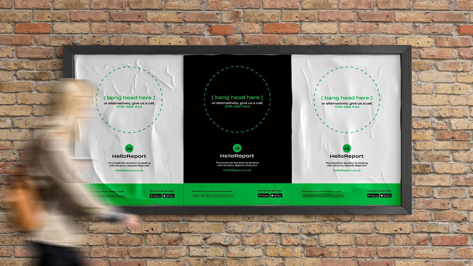
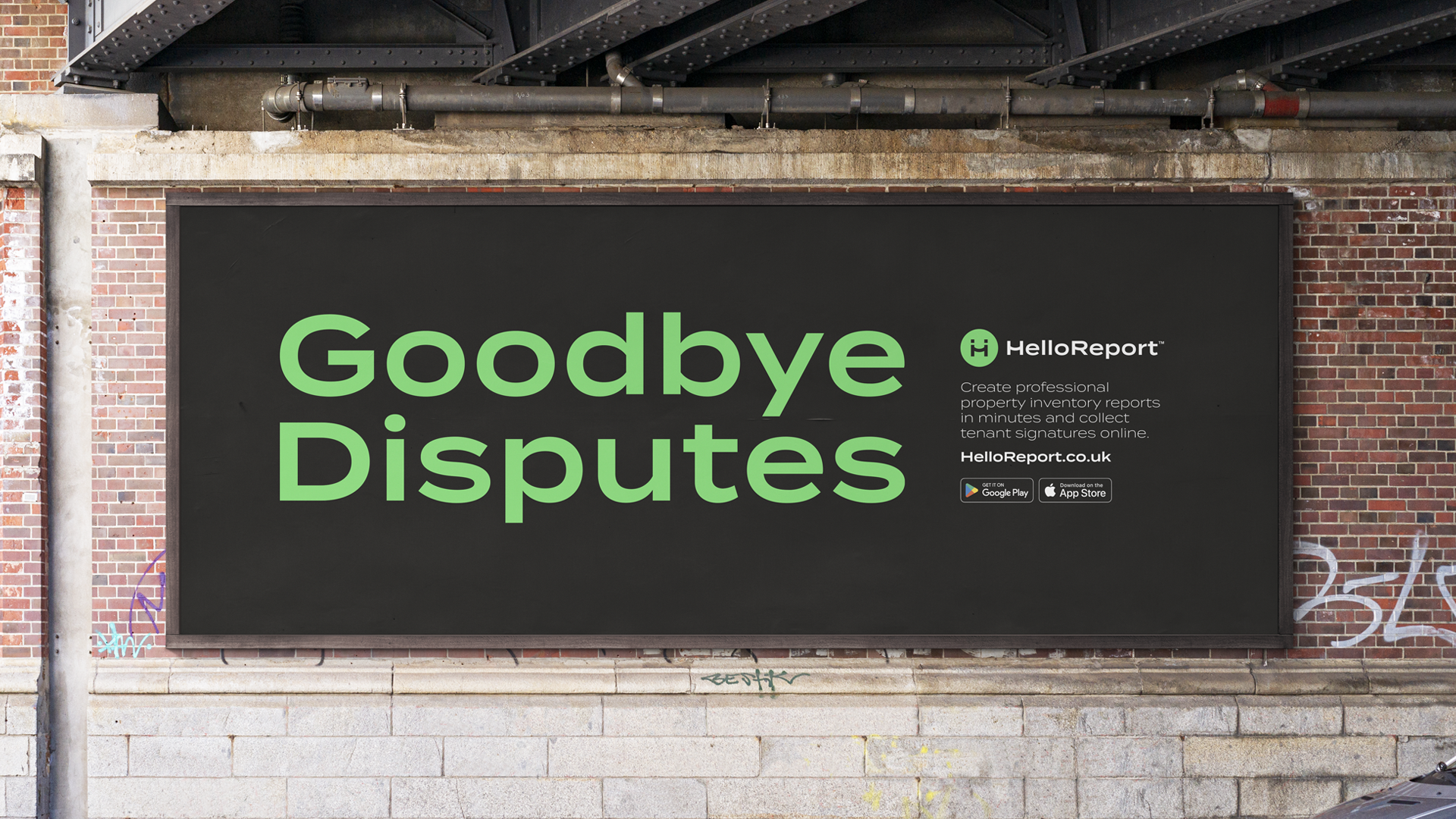
Since the launch of the new brand identity we have now helped roll it out across all of the key touchpoints including software, websites, social media channels, direct mail advertising and supporting explainer videos.
Now with over 2000 active users and an ever-growing awareness of the brand, HelloReport has gone from strength to strength with the business also seeing a clear rise in the quality and quantity of candidates throughout their recruitment drives, proving that a strong brand not only adds value in targeting and communicating to prospective customers but also to potential employees too!

To find out more about HelloReport you can check their website out here.
