Originally setting out in the supply of card terminals and paper rolls, they steadily widened their offering to include additional services such as print, warehouse and distribution.
Their focus had been very much on growing the business and servicing their clients which meant their branding and associated touchpoints were put on the back burner. Until now.
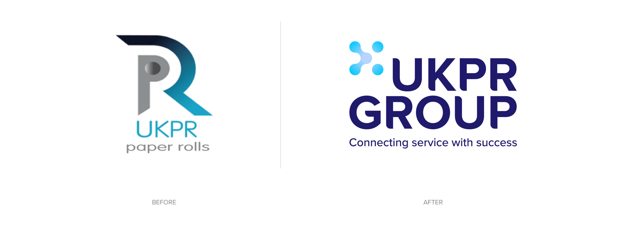
The team at UKPR originally approached us with a brief to redesign their website which then grew into a bigger conversation regarding their branding and position within their industry.
After a series of meetings to understand their vision for the business and their story, we set out to develop an identity that mirrored their position as leaders within their field whilst also creating a design system that would future proof their expectations for the brand moving forward.
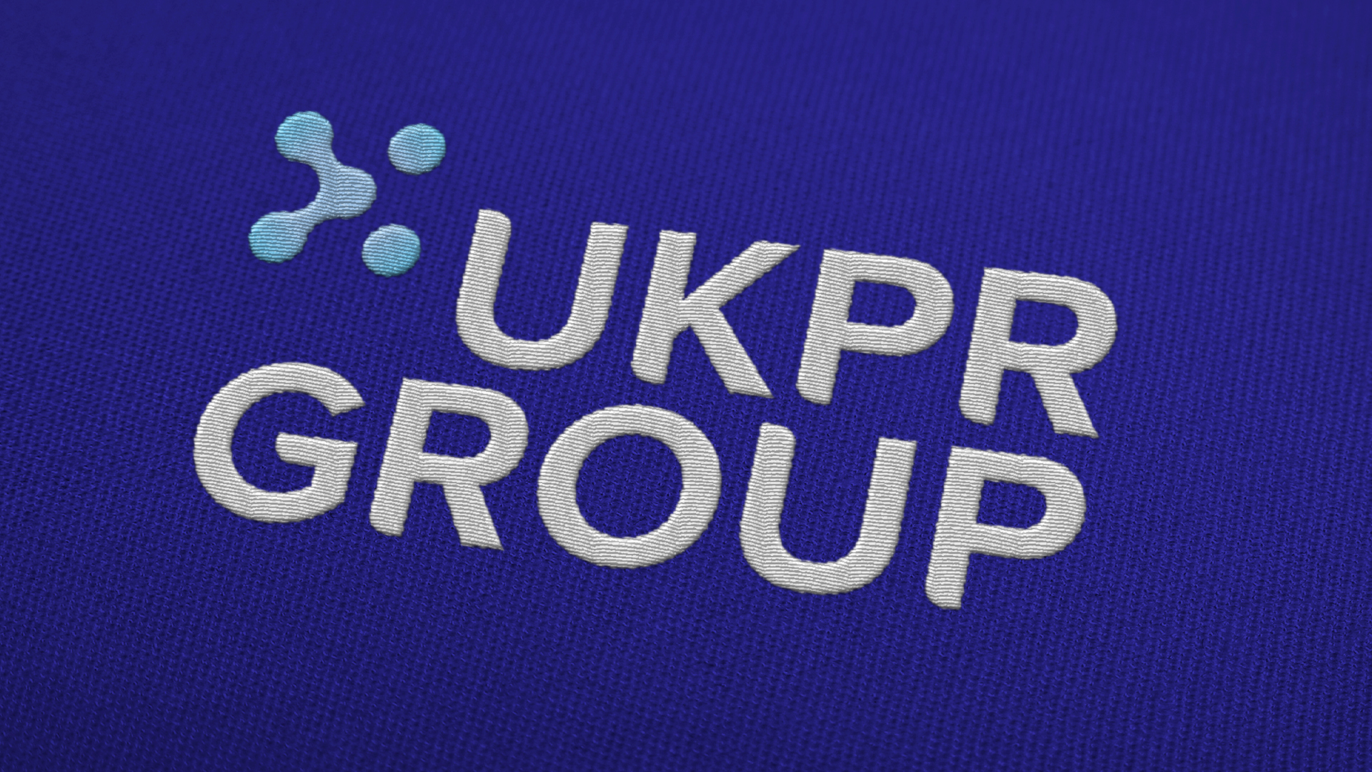
The identity developed builds around the concept of connection, emphasising UKPR’s role within the customers’ business journey, connecting them to the products and services required to support them through bespoke, tailored solutions.
A grid system constructed around five nodes was developed to build the primary logo mark as well as the marks for the additional sub-brands/services.
The primary logo mark features a series of connecting nodes resulting in a “cluster” incorporating a directional arrow which hints at the progression UKPR’s clients can achieve through their support and services.
A clean sans-serif typeface accompanies the mark, with subtle ownable modifications to soften key corners, providing a cohesive relationship between the logo type and the mark. A complimentary palette was introduced, made up of various blue tones, providing strong connotations to UKPR’s core values: trust, integrity and security; as well as offering bold contrast between the vibrant lighter hues and deeper base tones featured.
Based on the grid system, individual clusters were formed to differentiate between each of the five core sectors. Retaining the five nodes within each cluster contributed to the cohesion of the set while the variation of connecting line placement offered a distinctive, ownable mark for each specific sector.
Secondary palettes were developed for each of the five sectors to further enhance the distinction between each, utilising bright, radiant tones and subtle radial gradients to inject further vibrancy into the branding.
Collateral across various touchpoints utilises forms from the clusters to combine both content and imagery with a considered, refined look and feel. The palette’s primary blue provides a solid base for copy content while the curves of the cluster forms offer interesting crops housing background imagery focused on real people to strengthen the idea of approachability across the new identity.
Look out for the new UKPR Group website coming soon.