Background
It was now time for the organisation to move forward and create an identity for the brand that would allow them to prompt further awareness of their work and provide a recognisable platform that they could hang their activity from.

Approach
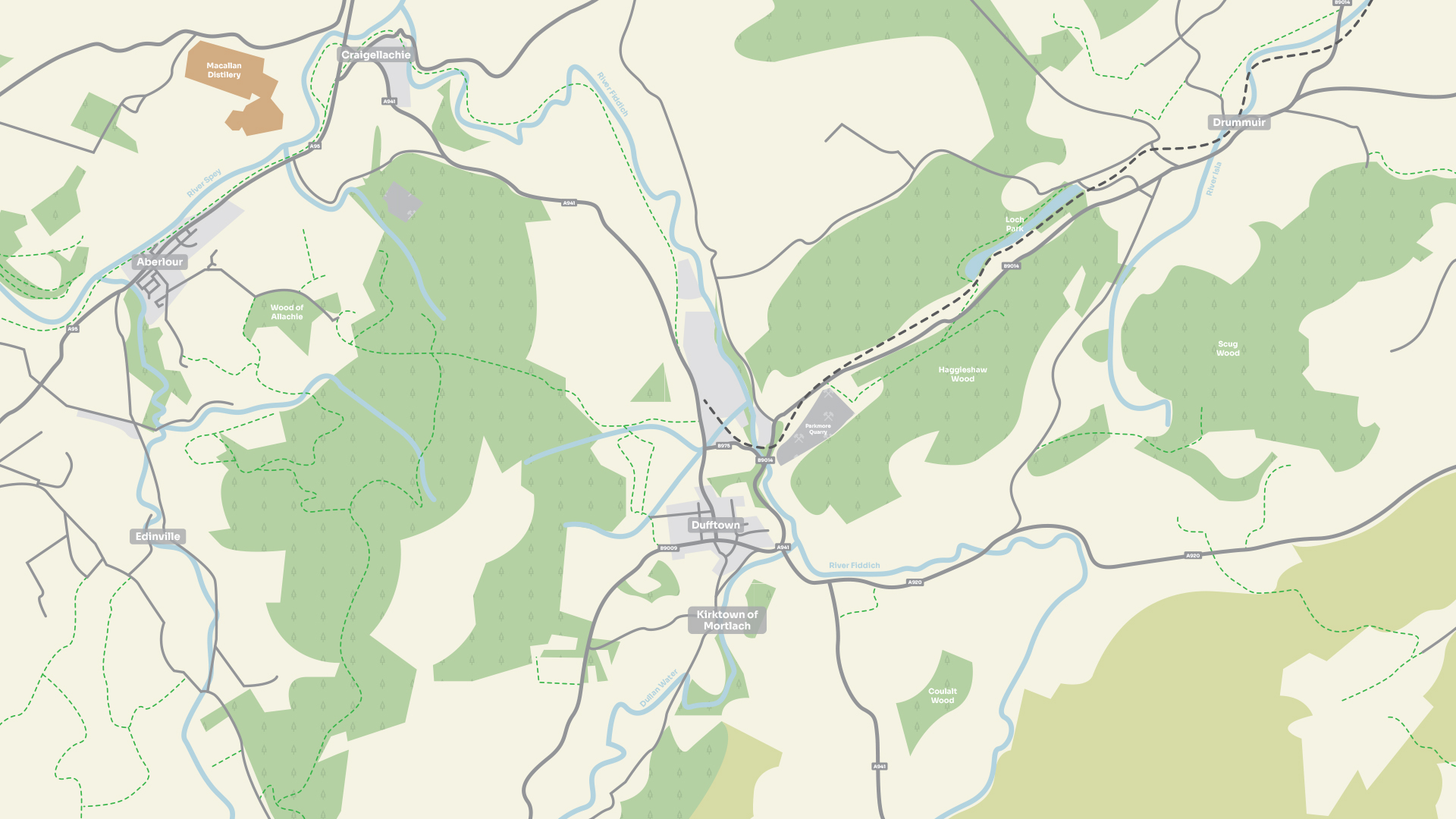
This also gave us the opportunity to get a deeper sense of their different audience types and the area of Dufftown itself. We then worked through the concept phase with a steering group of local stakeholders to focus in on a particular route to develop and refine this further. This was formed through an overall approach designed to offer an overarching identity could also be applied to the individual sub brands.
Delivery
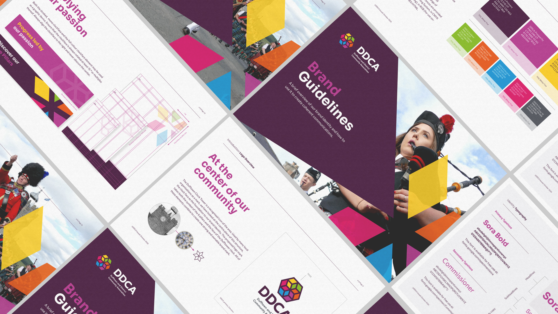
The logo mark was built around the iconic focal point of the town, The Dufftown Clock Tower. This local symbol had been utilised by many other community groups in the past so a new take on this would allow the DDCA to have that link present but in a much more ownable way.
The centre piece of the Clock Tower became the foundation to the whole identity and identity system with each of the 6 "diamonds" reflecting a specific pillar, all of which combine to create a bright and dynamic brand identity.
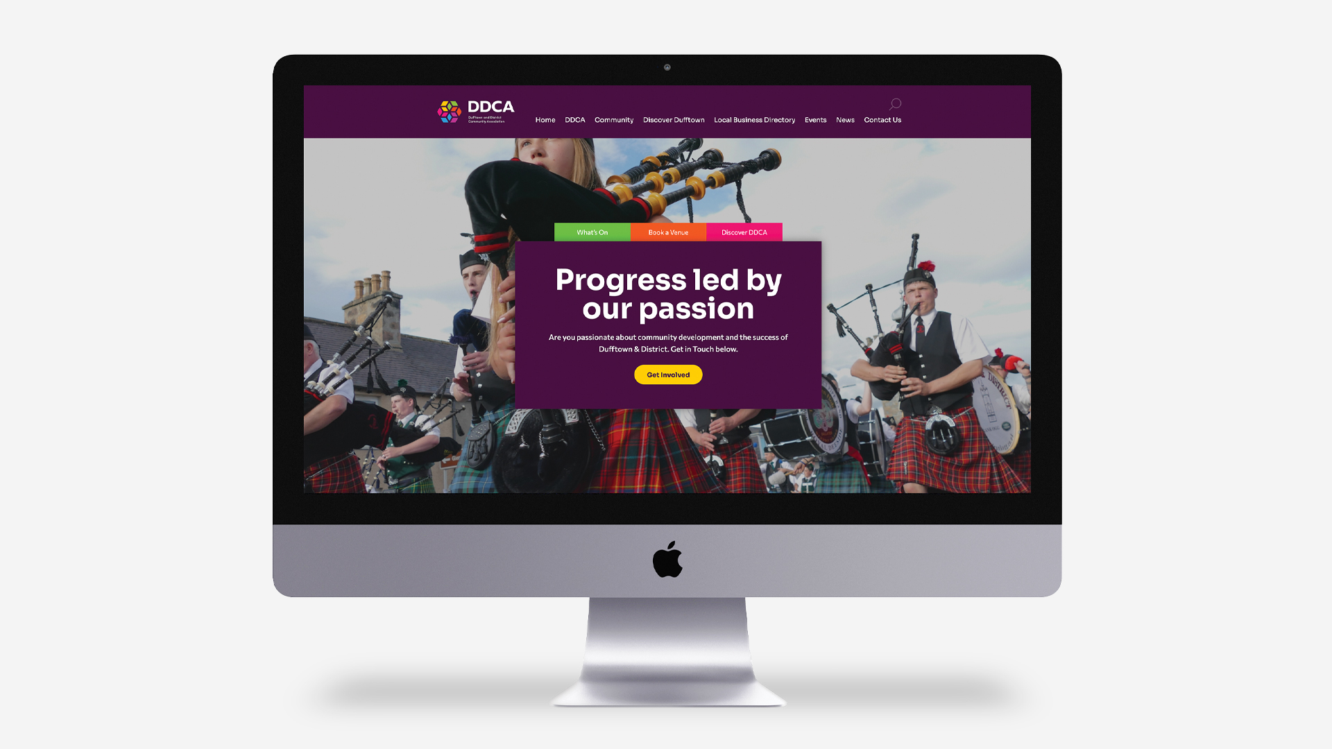
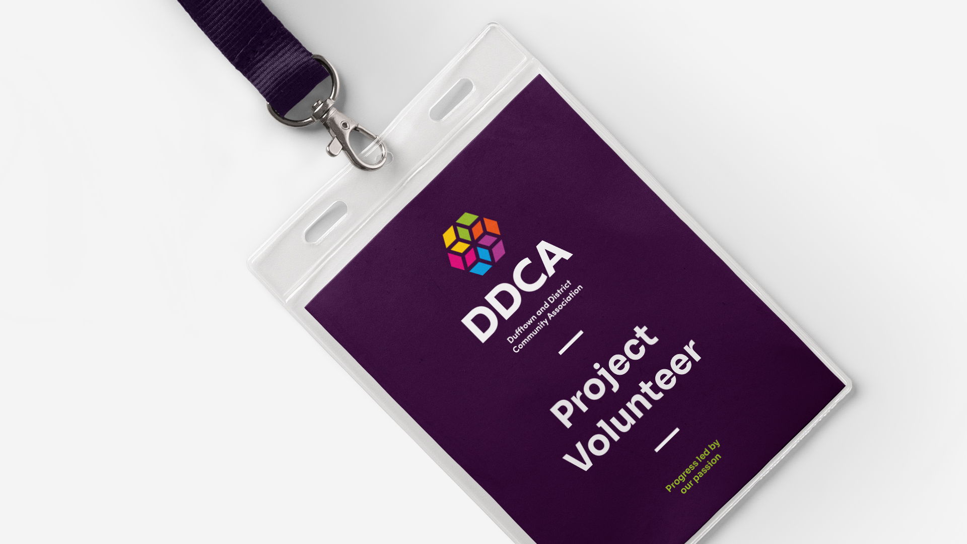
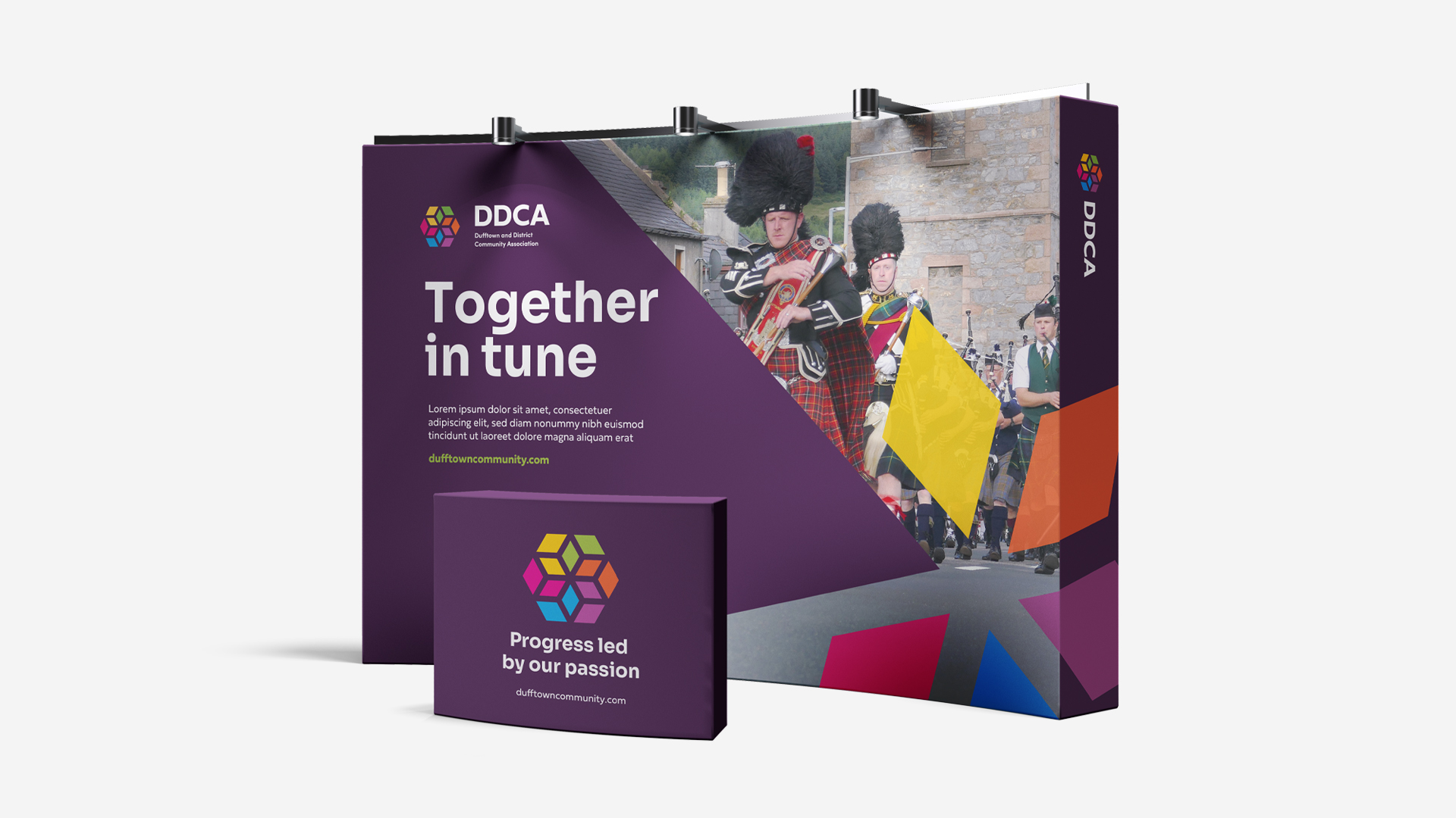
A simple yet flexible identity system was then developed which also included a palette, specific to each sub brand. This was then applied across a range of primary touchpoints including the organisation's website, branded stationery and interpretation boards.
