BACKGROUND
We began by analysing and exploring ideas around bringing Equiwatt's value proposition to life, identifying the areas where the brand could be built upon and connecting them with emerging demographics such as electric vehicle owners and families with connected smart homes.
This approach and process was invaluable as it helped inform the creation of initial concepts that achieved the desired look and feel for the brand.
APPROACH
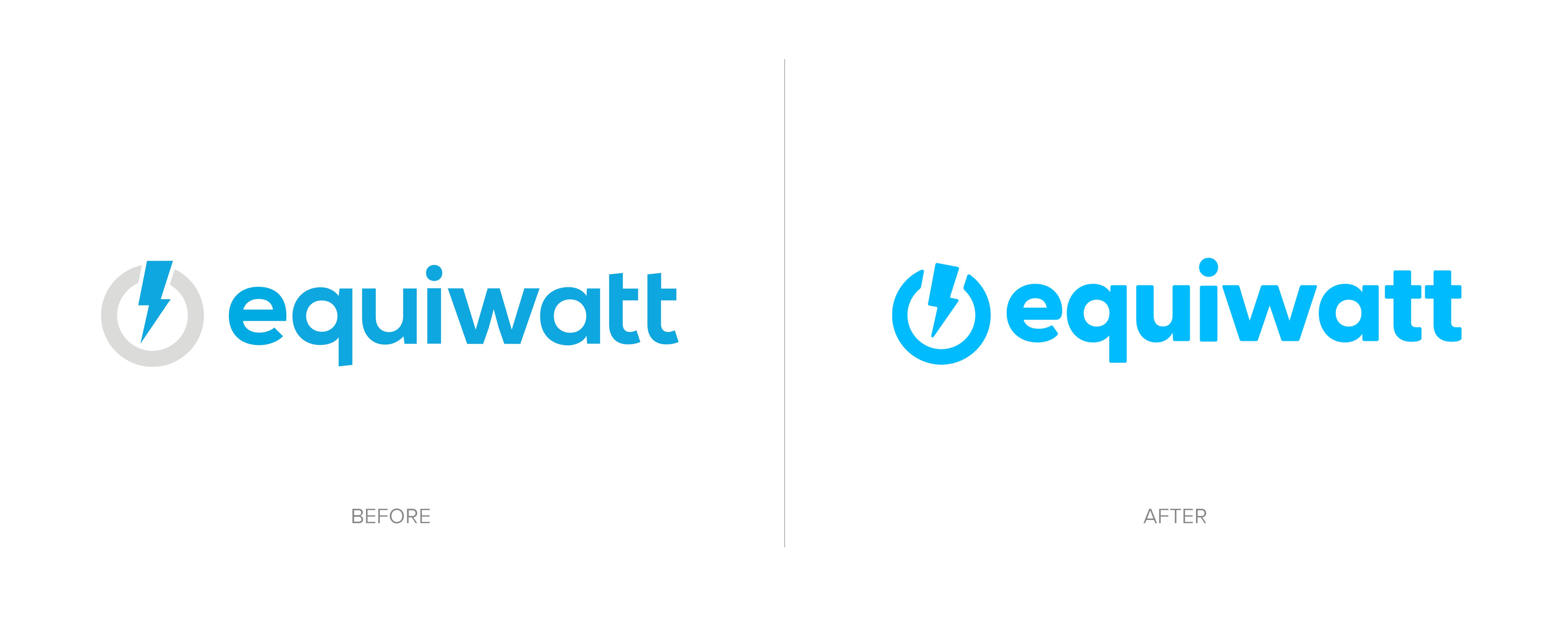
By rotating the bolt slightly along it’s axis, we helped to convey more motion and energy. All elements were rounded subtly, which gives a more friendly, inclusive and less formal feel. The logo now sits confidently in the primary brand colour. A clear statement, able to stand alone amongst the bright, colourful imagery of the visual identity.
DELIVERY
The graphic device of the bolt was used effectively to create unique and recognizable layouts that frame imagery and messages. A simple, easy-to-implement design system was created and clearly communicated via thorough brand guidelines, allowing Equiwatt to create content in—house, whilst maintaining consistency.

