Background
The project began by working with internal stakeholders at Sikkens Wood Coatings to understand the core reasons behind the pivot of the brand and it's offering. The brand was known in the industry for a high quality exterior range of wood coatings and the decision had been made by the organisation to stretch their offering to include an interior range. This was the catalyst to drive the project which then led to the unearthing of a set of new core pillars which acted as the cornerstone to the identity aligning with the vision of the brand and how it is perceived within the marketplace.
Approach
There were a high number of touchpoints associated with the brand, all of which would need consideration as part of the brand refresh.
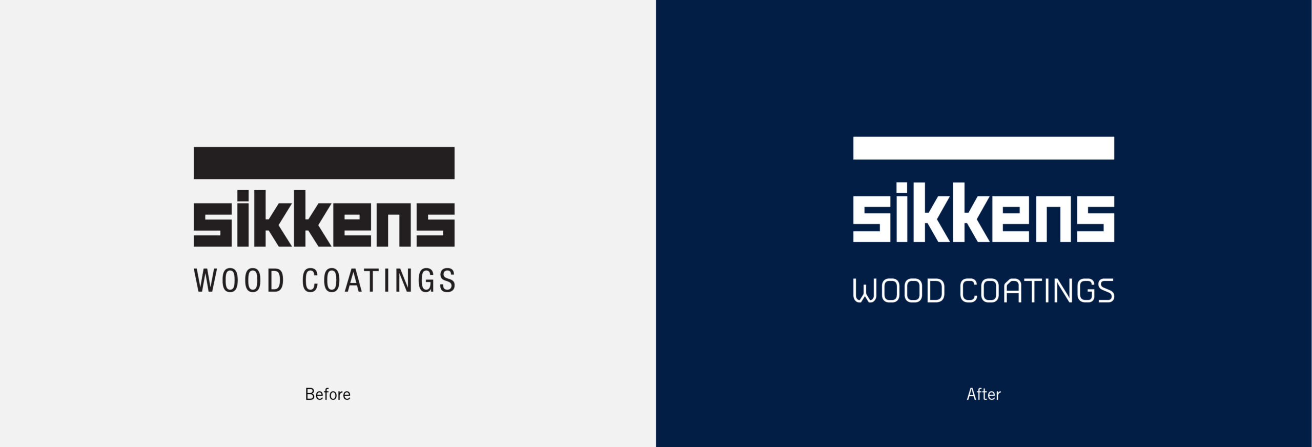
Looking through the existing identity and the associated branded communications, it was clear that the current brand identity no longer reflected the brand as a whole.
The review of the current identity and the new agreed core pillars of partnership, expertise and creativity lead to the development of the initial concepts. During the background research of the project it was clear that there were some brand assets that were hugely distinctive and recognisable which should be retained moving forward as well as other layers of the identity that were there to be evolved.
Delivery
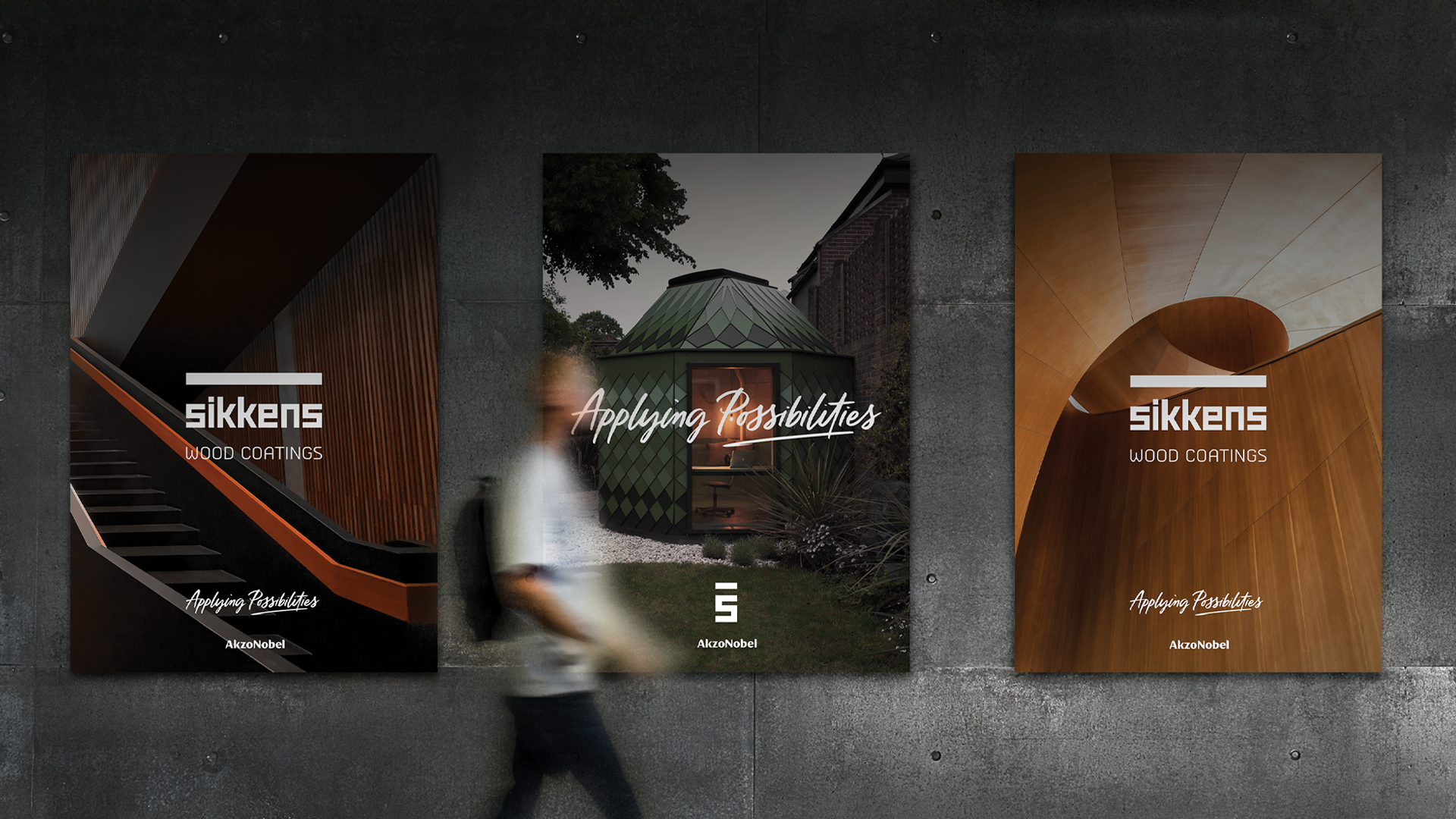
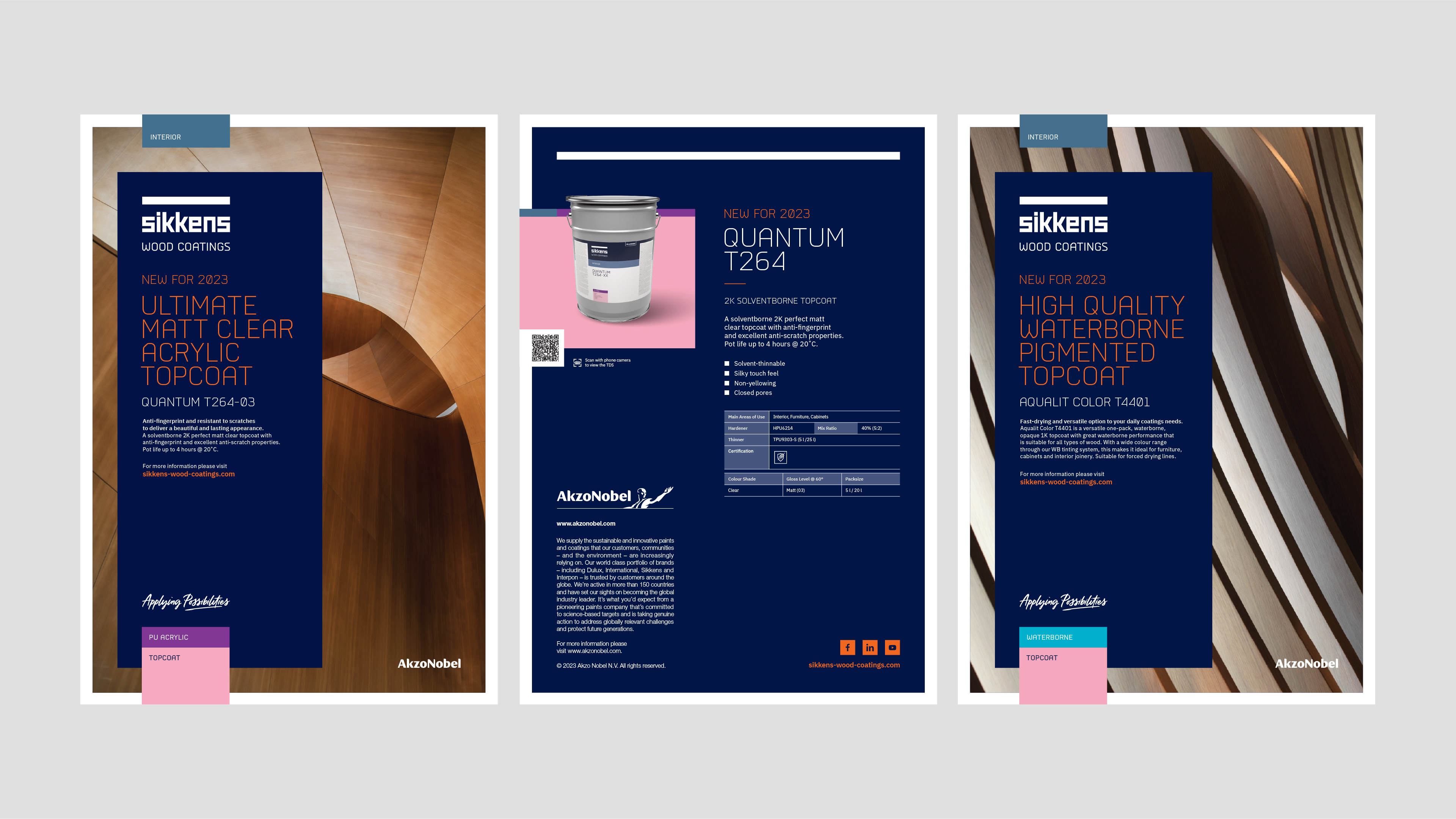
We retained the logo at the core of the brand evolution with some subtle refinements and built the rest of the identity around this as a distinctive asset to Sikkens Wood Coatings.
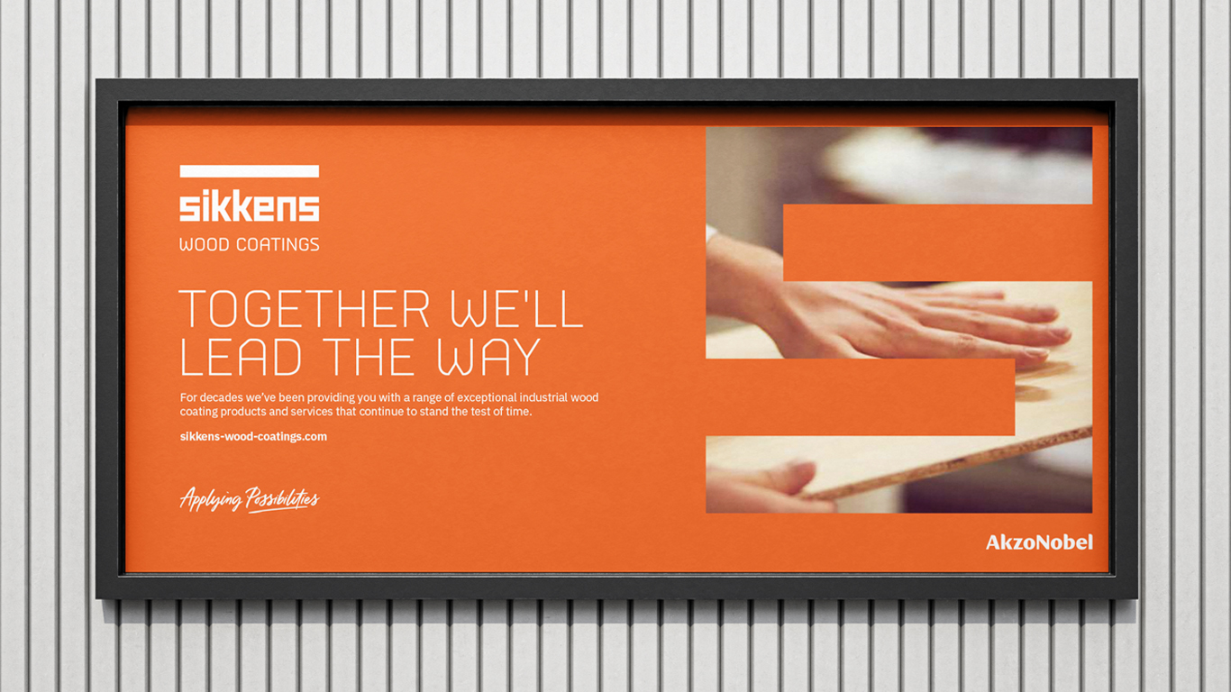
Moving on from the current "mono" colourway, the new colour palette offered the backdrop to the overarching design approach. A deep blue provided a level of sophistication, contrasted with a vibrant orange to create a dynamic and contemporary industrial look and feel.
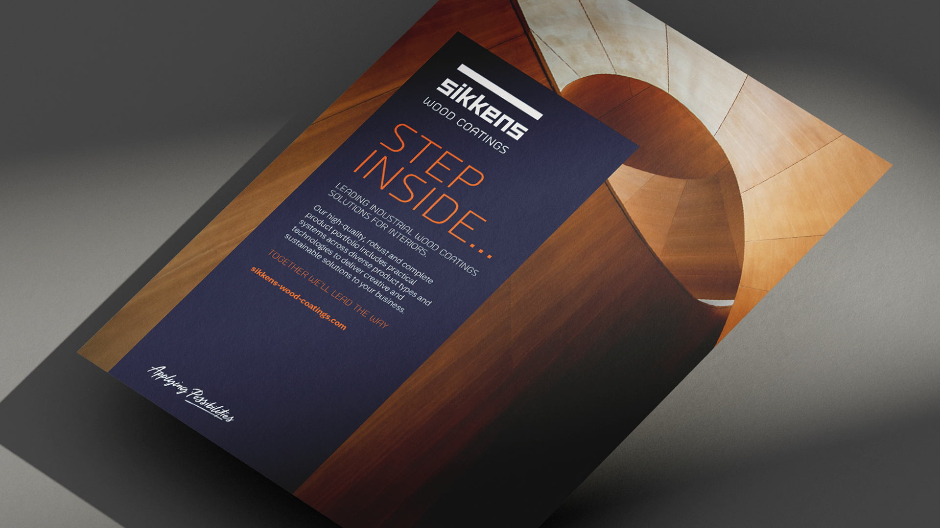
The development of a new brand strapline "Applying Possibilities" was also a necessary progression from the existing and dated "Passion for Wood". This encompasses the core pillars and the idea of working in partnership to explore what's possible in the development of wood coatings for their customers. Solutions are "off the shelf" whereas "Possibilities" are endless.
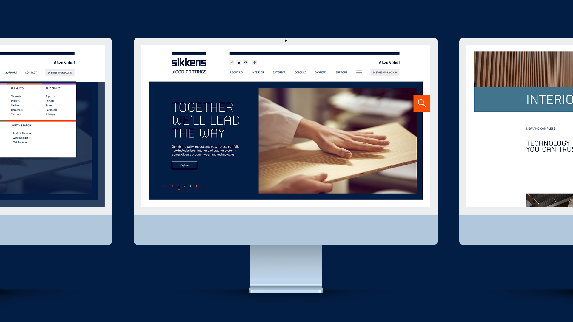
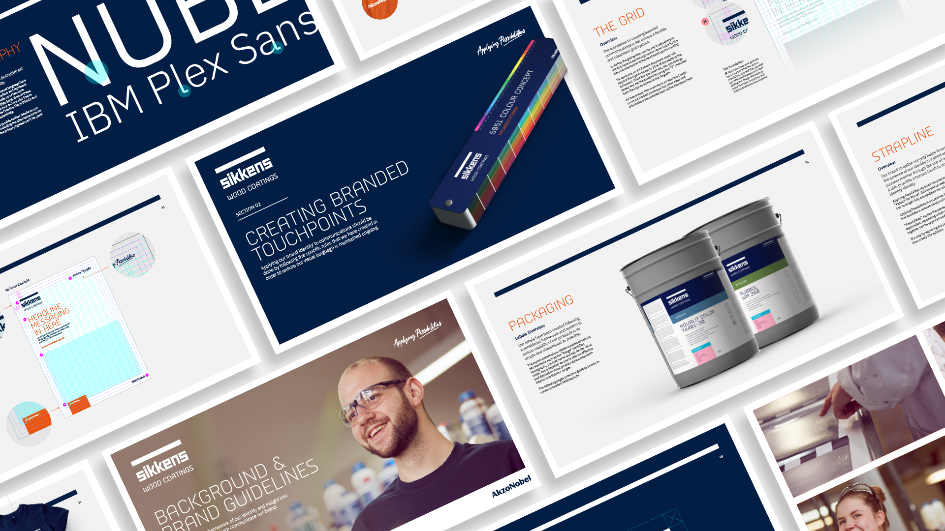
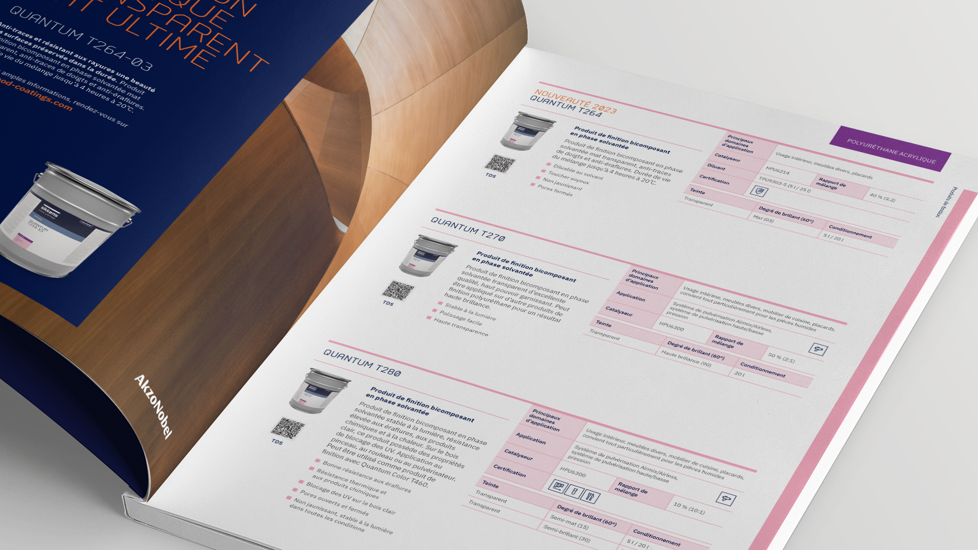
A modern and distinctive typeface was identified, along with a structured brand and colour system which includes the use of a layered tab device, created as a range, technology and category identifier for both print, digital and packaging use.
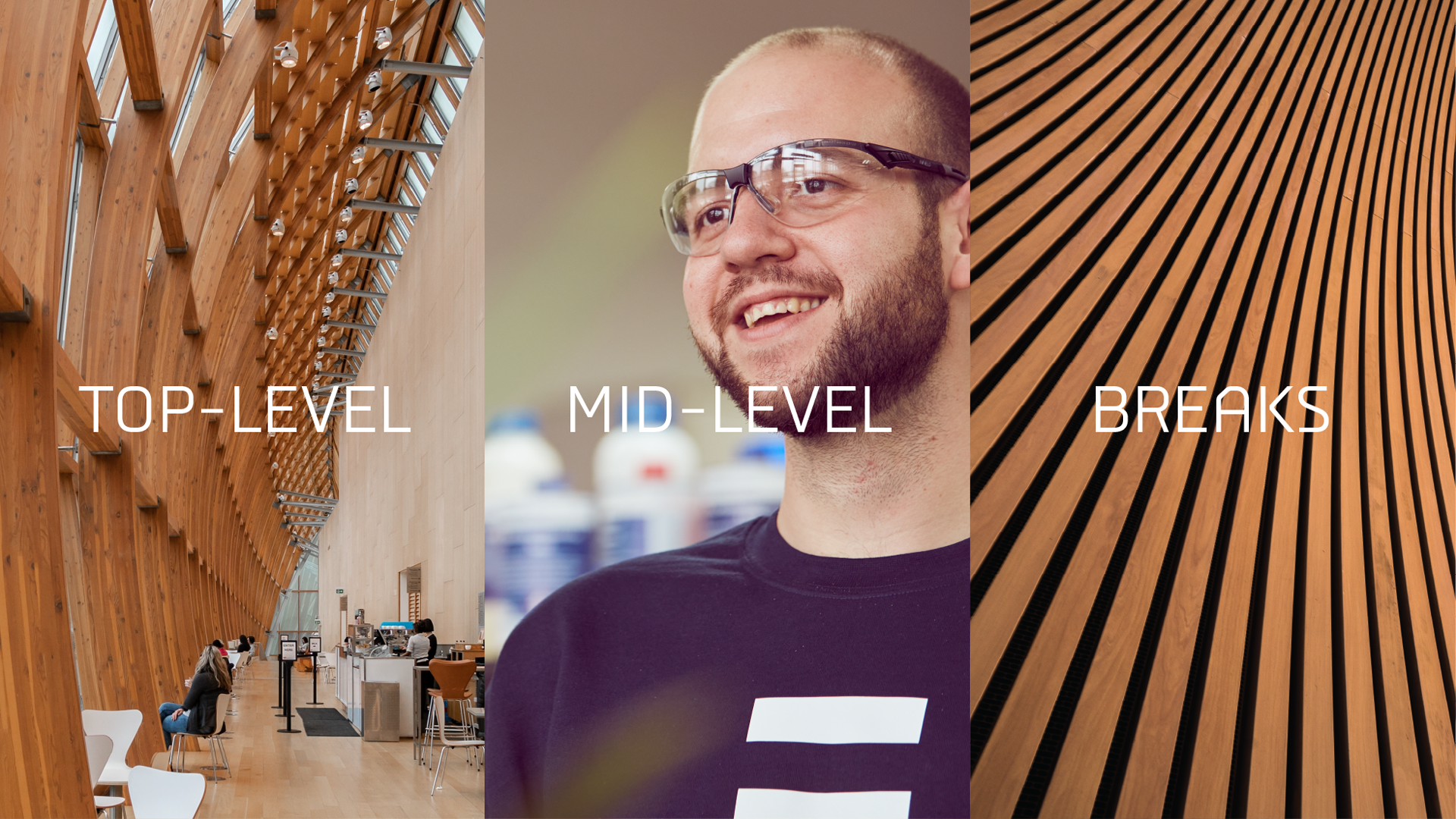
The supporting art direction style was split across three layers (top-level, mid-level and breaks) to cover a wide range of aspects of the brand from aspirational use of product supported by human focused imagery to highlight the real people behind the brand and the "breaks" which are used as a contrasting visual intrigue within comms.
A stylised new set of iconography was created to mirror the look and feel of the overarching branding and a coherent and concise tone of voice developed that embodied the brand as a whole.
In addition to the overarching brand identity development, a supporting brand campaign was created for the launch of the brand refresh with the headline of "Together we'll lead the way" being the primary message. This messaging was supported with the use of the "S" device. An asset that is an extension of the logo and symbolises the look and feel of the Sikkens Wood Coatings identity within one simple and recognisable mark that can be used as an aperture to hold imagery and footage. This "S" device links back to the topline message in motion by creating a pathway forming from the bottom left through to the top right, evoking a sense of a journey.
All of these elements of the brand system fed into the creation and delivery of a wide range of touchpoints across multiple languages from a whole new labelling/packaging system, brand brochures and sell sheets, website UI and UX, posters, vehicle livery, colour tools, branded merchandise, motion graphics, script writing, brand videos and much more.
The launch of the brand refresh initially includes the interior range with the exterior range communications coming soon.